
Fernand Léger was a painter who did not see the world as we did. He recognized the lines of buildings and the curves of machinery, the rhythm of the city all with a feeling of life and connection in their eyes. In this unique perspective, his artwork leaves us with the beauty of shapes and colors in motion. His most famous work is Contrast of Forms which makes this vision come alive. Léger doesn’t shy away from bold colors and simple shapes in his paintings but combines them to create a piece that feels both familiar and exciting.
Let’s dive into who Léger was, what makes Contrast of Forms special, and how this painting continues to intrigue viewers today.
Who Was Fernand Léger?
Fernand Léger was a pioneer in modern art, whose works were colorful and dynamic and celebrated modern life. He was born in Argentan, France in 1881; he began his career as an architectural draftsman. His art grew from this background in design with a unique structure. He moved to Paris where he began integrating himself into the effervescent art world, exploring new styles like Cubism and working alongside renowned artists Pablo Picasso and Georges Braque.
Léger was a lively cubist addition to many of the cubist artists, who tended to focus on abstract shapes. With his ‘Tubism’, often bold colors and cylindrical forms, he filled his art. For him, art should be the manifestation of the energy of the city and his works often culled from the busy life around him. Léger’s innovative spirit saw him move out into the realms of film, graphic design and set design as well as painting. Today, his commitment to making art accessible and relevant inspires artists.
FUN FACT: In 1924, he created Ballet Mécanique, an experimental film that features everyday objects like hats, pots, and even human limbs, all moving in sync with one another.
His Career
In the early 1900s, he joined the community of international artists beginning to reshape modern art as members of the École de Paris. His work changed over the years from first Cubism to more bright and fanciful. Léger became interested in the relationship between people and machines in the 1920s, he mostly painted the interplay of humans and technology.
The travels he made broadened his perspective, and everyone who saw the art could tell. Léger revered the everyday life of people in the city. In a hectic urban environment, he was sure that beauty and joy could be discovered. His famous work, The City, shows clearly this belief in urban life.
What’s Happening in Contrast of Forms?
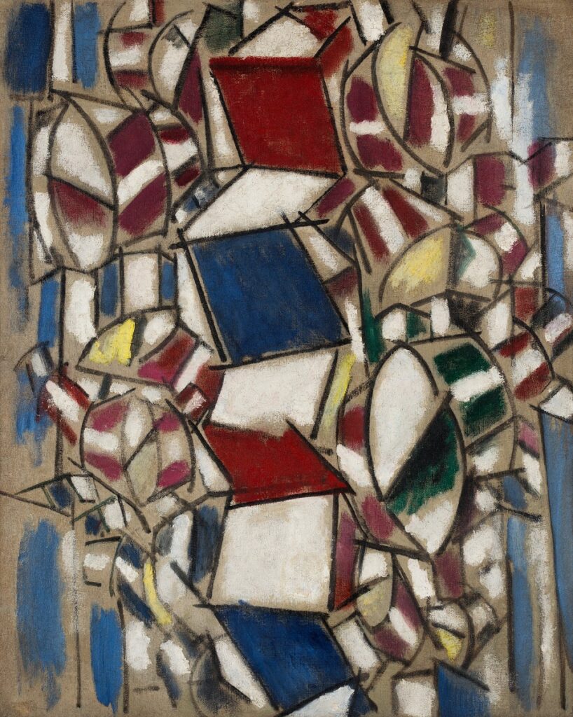
| Artist | Fernand Léger |
| Date Created | 1913 |
| Medium | Oil on Canvas |
| Genre | Abstract |
| Period | Modernism |
| Dimensions | Approx. 92 x 73 cm |
| Series / Versions | Part of Léger’s exploration of Cubism, also called “Tubism” |
| Where is it housed? | Solomon R. Guggenheim Museum, New York City |
When you first look at Contrast of Forms, you’ll notice its strong, simple shapes: lines, cylinders, and blocks, floating on the canvas in their own way. These shapes seem to be talking to one another in a silent conversation. Reds, blues, and yellows all stand out in dark, bold colors. This piece has a sense of order and motion.
It might look random, but Léger had planned out every shape and color very carefully. This painting is not just a lineup of shapes, it’s a rhythm, a beat where your eyes continue drawing you from side to side. Léger assigned these shapes to create a serene mood as well as one that was energetic. He wanted the viewers to feel the energy of that time: when machines and people were intersecting to create what felt like a new kind of modern life.
What Makes Contrast of Forms So Special?
After all of these years, why does Contrast of Forms still pull you in? Part of it is its simplicity. Léger used everyday shapes and showed us how they could play one off another. Basic forms such as cylinders and blocks become part of a larger story in his hands. They’re not sitting on the canvas they’re moving, putting together some sort of rhythm.
Léger had a special way of celebrating people and machines. He paints us a feeling of unity in Contrast of Forms, combining human warmth with the precision of mechanism. The piece is tough or soft or dark or light, a balance of opposing things that make it come alive. This work helps us remember that simplicity can lend beauty.
Interesting Facts About Contrast of Forms
New Tubism Style: Léger’s version of Cubism focused on rounded, tubular shapes rather than broken, angular ones. This gave his work a feeling of fullness and movement, which he called “Tubism.”
Bold Colors with Purpose: Unlike many abstract artists, Léger used colors in a way that felt warm and inviting. His blues, reds, and yellows give Contrast of Forms an energy that almost feels musical.
Pure Abstraction: This painting marks Léger’s step toward pure abstraction, meaning it doesn’t directly represent any specific person or object. Instead, it’s about the feeling and movement of the forms themselves.
Emotion in Geometry: Even though it’s abstract, Contrast of Forms feels alive, as if the shapes are interacting in a meaningful way. Léger’s genius was in making something industrial feel warm and engaging.
Artwork Spotlight: La Ville, La Tour Eiffel

Léger’s La Ville, La Tour Eiffel is available on Singulart. This artwork captures the heartbeat of Paris, with the Eiffel Tower standing as a familiar figure in a landscape of colors and forms.
Are you looking for a piece of artwork from Fernand Léger?
Singulart has limited edition prints of Fernand Léger. If you are looking for a piece of Léger‘s artwork for sale, simply click on the artwork or the button below to discover more!
FAQs
1. What was Fernand Léger known for?
From 1940 to 1945, Léger resided in the United States; but, during the war, he returned to France. Léger worked on a variety of projects in the ten years before his tragic passing, such as murals, colossal figure paintings, and book illustrations.
2. What style of painting is Fernand Leger?
Fernand Léger was greatly impacted by Cubism and contemporary industrial technology. He created “machine art,” a style distinguished by large, mechanical shapes painted in vivid hues.
Conclusion
Contrast of Forms isn’t just a painting; it’s an experience. Through Léger’s vision, we can see a world where shapes and colors tell a story, where simplicity holds depth, and where art connects the mechanical and the human. With Contrast of Forms, Léger invites us to appreciate the art of shapes and the rhythm of the modern world.


