
The street art sensation, now a global art star, RETNA has always been good with words. Not just in the conventional way, but in the way he integrates letters and symbols in his work. His style, a hybrid of ancient scripts and modern graffiti, has won him many eyes. But his piece Sad to See? It has a way that never stands apart too much—it’s hard to describe, almost like it’s speaking to you without saying anything.
Imagine you are standing there in front of the large canvas, the swirls of shapes and lines that look like they’re all telling some story. The lettering, in soft blues and whites, is RETNA’s signature throughout. It is calm but slightly sad, just some space gently pulling you to pause a second to think. The letters curve and flow like they’re floating in the air like there’s a kind of beauty to it. Here, we’ll walk you through (and spoil!) RETNA’s incredible career, what’s going on in Sad to See, and why this is so special. Ready? Let’s dive in.
Who Is RETNA?
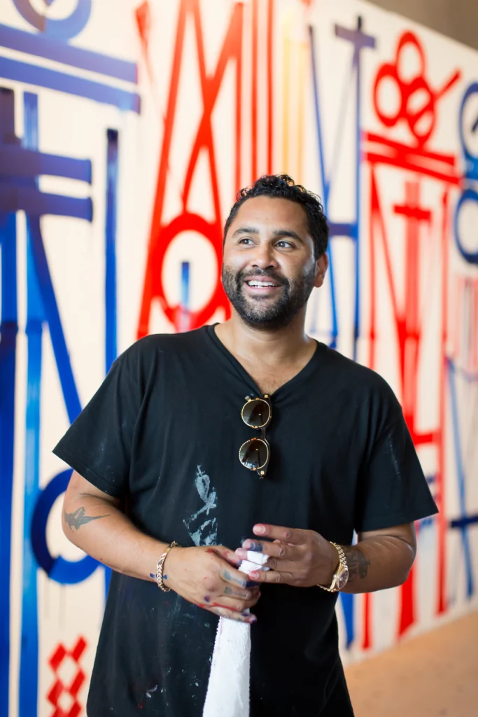
Marquis Lewis, known as RETNA, is an LA graffiti artist born in 1979. He developed over the years his style which blends street art with mystical symbols that look very ancient. His paintings were bold and striking, blending elements of calligraphy, hieroglyphs, and global scripts. The fact that his art feels both old and futuristic at the same time is what sets him apart. The walls, buildings, and galleries of the world are a landscape for RETNA’s art. He’s not just a street artist, he’s invented an entirely new visual language that transcends culture.
RETNA’s transition to gallery walls was seamless while many know him for his sprawling murals. His line work is elegant and his symbols speak to their cultural references deeply to viewers. There’s something hypnotic about this art — it has a rhythm that’s somehow hard to look away from.
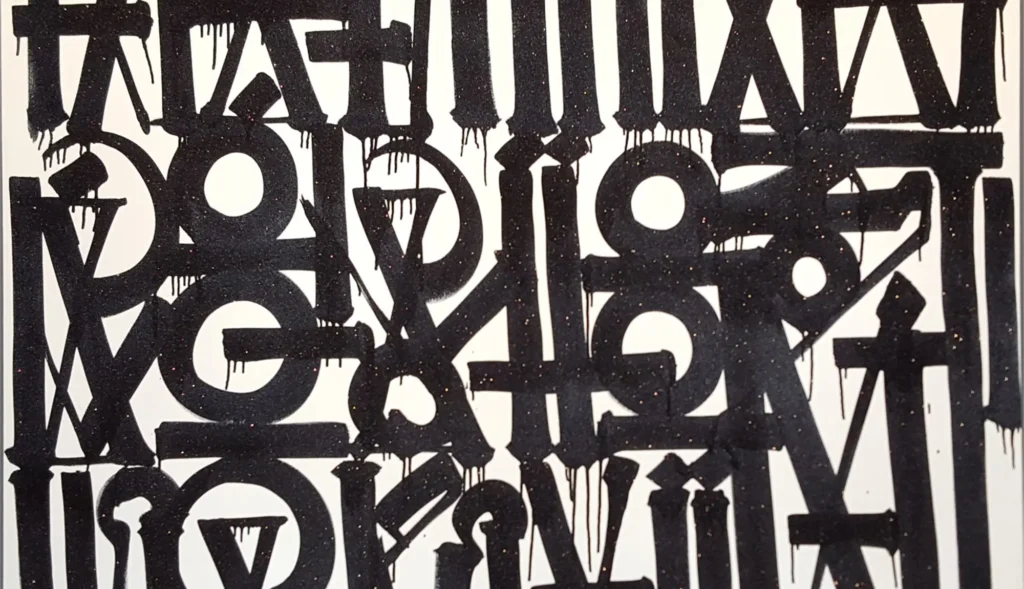
FUN FACT: His unique script is inspired by multiple global influences, including Egyptian hieroglyphs, Arabic calligraphy, and even gang graffiti. He often combines these into his own visual language.
His Career
RETNA, who started his career as a graffiti artist in the early 2000s, quickly became renowned for his signature style. His art is a combination of different styles and all kinds of things mixed into it—Arabic, Hebrew, Asian, and even Incan scripts. This mix makes his work feel timeless as if you are looking at something ancient, but modern. He has worked from large murals in cities to exhibitions in eclectic and prestigious galleries, and as far as projects with brands such as Louis Vuitton. From the streets to the high-end spaces; his art is everywhere.
One of his most famous projects was designing the cover art for Justin Bieber’s Purpose album. His ability to cross over into mainstream culture without losing his unique touch makes him a standout in the world of contemporary art.
What Is Happening in Sad to See?
| Artist | RETNA (Marquis Lewis) |
| Date Created | 2015 |
| Medium | Mixed media on canvas |
| Genre | Abstract, Calligraphic |
| Period | Contemporary |
| Dimensions | 60 x 48 inches |
| Series / Versions | Part of a larger body of calligraphic works |
| Where is it housed? | Private collection |
It may look like a jumble of letters and symbols when you first glance at Sad to See, but there’s much more happening. The artwork feels like a soft, sad, and also reflective conversation. The sense of calm but melancholic mood is in the softer blues and whites that replace RETNA’s familiar calligraphy.
Despite the letters being hard to decipher, they appear to have a weight of emotion. They flow through the canvas like waves of thought or memories. As with Sad to See, RETNA doesn’t explain exactly what the letters mean, or what makes the piece beautiful; it demands we fill in the blanks.
What’s So Special About Sad to See?
It is the way RETNA is able to talk about so many of these emotions with so little that makes Sad to See so unique. It is simple but complex. The soft colors and flowing script give off a mood of quiet but the details of the letters, how they are placed, and how they move to show you that there is more to this than meets the eye.
One can recognize RETNA’s signature style here. With each letter adding to the overall story, his use of calligraphy turns the artwork into a visual poem. Sad to See is more subtle, almost like a whisper, but unlike his more colorful pieces. It is the balance of simplicity and depth that makes the piece so mesmerizing. It’s not just how it looks, it’s how it makes you feel.
Interesting Facts About Sad to See
A Unique Visual Language: RETNA’s calligraphy isn’t just for show. He’s created his own visual language by blending different scripts from around the world. In Sad to See, this language takes center stage, turning the canvas into a written story that we may not fully understand, but can definitely feel.
Muted Colors, Deep Emotions: While many of RETNA’s works are vibrant and bold, Sad to See uses a more muted palette. The soft blues and whites give the piece a quiet, reflective mood. It’s a change from his usual style but shows how versatile RETNA can be.
A Personal Touch: Even though we may not know exactly what RETNA’s letters mean, the emotions they convey feel personal. Sad to See taps into universal feelings of sadness and reflection, making it relatable to anyone who views it.
French Influence: RETNA’s travels to Paris have had a big impact on his work. In Sad to See, you can sense a bit of that je ne sais quoi—a touch of Parisian elegance mixed with raw emotion. This subtle influence adds another layer of depth to the piece.
Artwork Spotlight: Acrylic Painting

RETNA is known for his work with acrylics—like in Acrylic Painting which is also available on Singulart. In this artwork, bold colors and strong lines dominate. The mixed media approach allows for a softer, more emotional touch, highlighting his ability to adapt his style to fit the mood of each piece.
Are you looking for a piece of artwork from RETNA?
Singulart has limited edition prints of RETNA. If you are looking for a piece of RETNA‘s artwork for sale, simply click on the artwork or the button below to discover more!
FAQs
1. What is RETNA painting?
American street artist RETNA is well-known for his distinctive letterforms and typography. Graffiti, photography, painting, and other diverse media are all explored by RETNA through the use of visual linguistics, urban poetics, and appropriated fashion images.
2. What nationality is RETNA?
Born Marquis Lewis in 1979, RETNA is a modern artist best known for his graffiti creations. He began his career in the early 1990s and was reared in Los Angeles, California.
Conclusion
Sad to See by RETNA is more than just a work of art—it’s an experience. The piece invites you to slow down, look closely, and let yourself feel the emotions woven into the intricate script and soft colors. Whether you’re an art collector or someone who simply enjoys beautiful things, Sad to See will leave an impression that lingers long after you’ve seen it.


: The Story of Caravaggio and His Innovative Style")
