
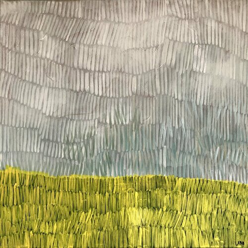
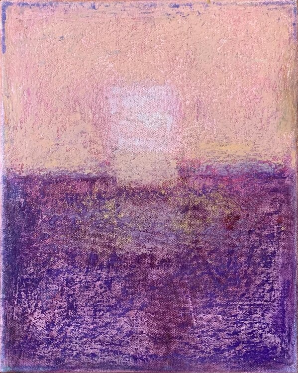
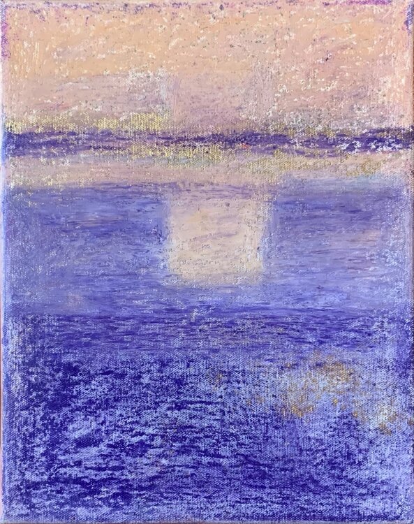
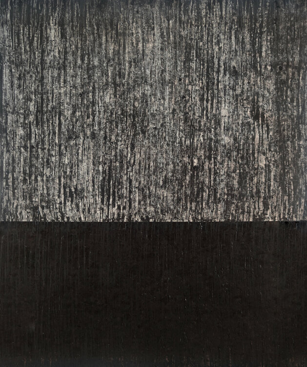
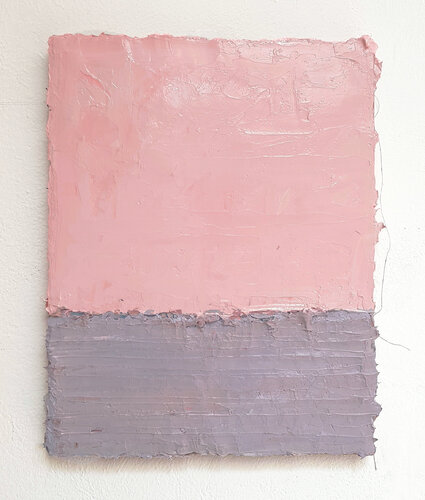
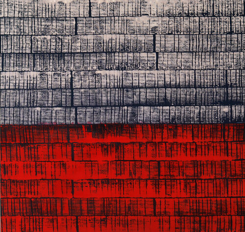
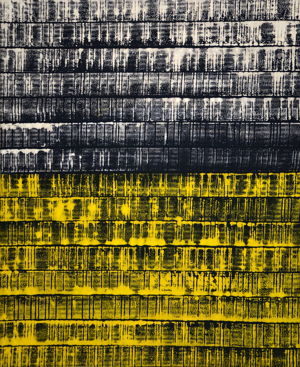
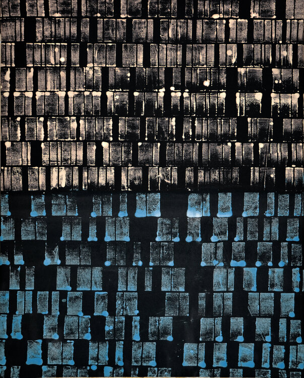
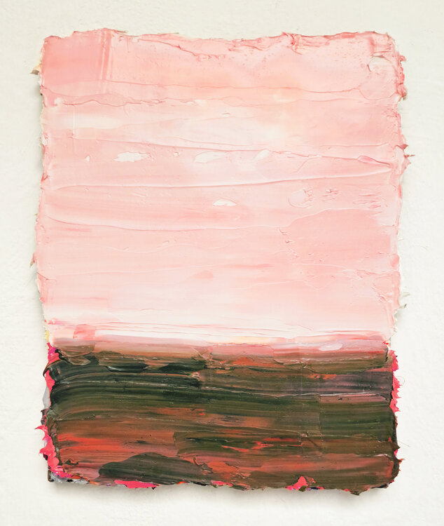
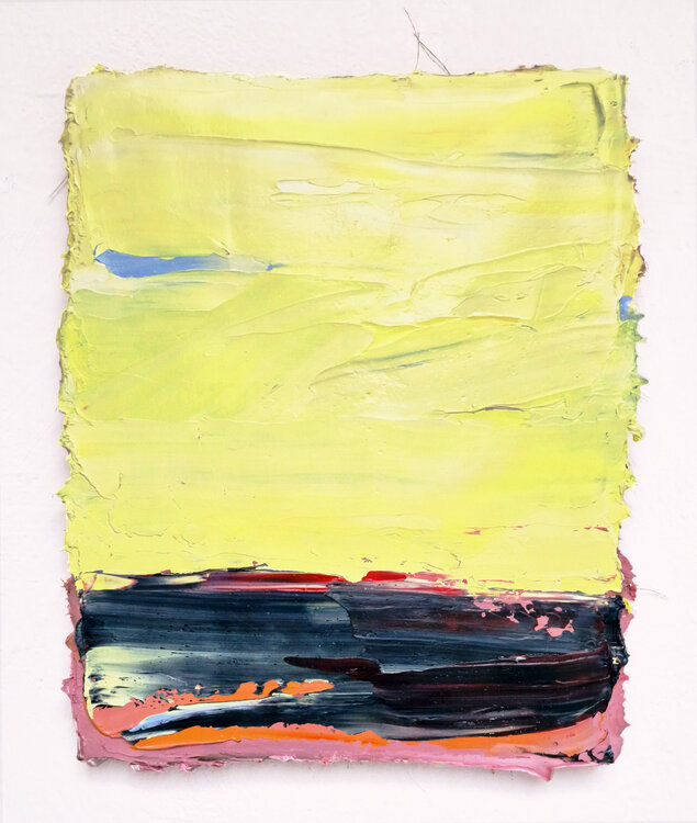
A curation by Natalie Slater, Curator at Singulart - Color sits differently within each of these compositions. In some, it gathers along the bottom edge; in others, it is pushed upward or divided into two distinct areas. Several meet somewhere in the middle, shifting where the eye lands first.
That sense of weight also comes from the color itself. Darker tones can make a relatively small section feel much more dominant, while lighter shades open up larger areas of the composition. In other works, a strong or saturated color pulls the eye toward the top or bottom almost immediately.
The placement may be simple, but the balance is not. Each artist handles color, proportion, and density differently, changing how the work is read from the first glance.
16 Artworks





Did you enjoy this collection?
Find out every time we publish a new collection
and receive an exclusive email!
and receive an exclusive email!
Shop more artworks
Find inspiration from our most popular styles


